If your rotateY(180deg) animation isn’t displaying as expected, here are some common troubleshooting steps to consider:
- Check CSS Syntax: Ensure your CSS is properly written. The animation should be defined correctly with the right keyframes.
#css
body {
    display: flex;
    justify-content: center;
    align-items: center;
    height: 100vh;
    background-color: #f0f0f0;
}

.parent {
    perspective: 1000px; /* Required for 3D rotation */
}

.animated-element {
    width: 200px;
    height: 200px;
    background-color: #3498db;
    display: flex;
    justify-content: center;
    align-items: center;
    color: white;
    font-size: 24px;
    border-radius: 10px;
    animation: rotate 2s forwards; /* Start animation immediately */
}

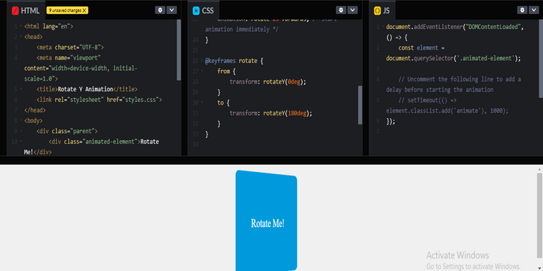
@keyframes rotate {
    from {
        transform: rotateY(0deg);
    }
    to {
        transform: rotateY(180deg);
    }
}
Element Visibility: Ensure the element you’re animating is visible and not obscured by other elements. You can add a background color temporarily to see if it’s being rendered.
Perspective: If you’re rotating in 3D space, you may need to set a perspective on the parent element.

HTML Structure
#html
<!DOCTYPE html>
<html lang="en">
<head>
    <meta charset="UTF-8">
    <meta name="viewport" content="width=device-width, initial-scale=1.0">
    <title>Rotate Y Animation</title>
    <link rel="stylesheet" href="styles.css">
</head>
<body>
    <div class="parent">
        <div class="animated-element">Rotate Me!</div>
    </div>
    <script src="script.js"></script>
</body>
</html>
JavaScript (script.js)
For this example, you can optionally add JavaScript to trigger the animation on a button click or after a delay, but it will animate automatically as set in the CSS.
If you want to trigger it with a button, you could do something like this:
#javascript
document.addEventListener("DOMContentLoaded", () => {
    const element = document.querySelector('.animated-element');

    // Uncomment the following line to add a delay before starting the animation
    // setTimeout(() => element.classList.add('animate'), 1000);
});
Review
This setup will create a simple webpage where a box with the text “Rotate Me!” will rotate 180 degrees around the Y-axis. Make sure to include the CSS and JavaScript files correctly, and adjust the timing or styles as needed! If it still doesn’t work, check your browser’s developer tools for any errors or warnings.
Transform your online presence with a strong boost from our professional website redesign solutions. From small changes to full redesigns, our team of skilled web developers creates breathtaking results that convert.
Related Links!
- Aligning Gradient Heading and Button on Same Line!
- Creating a Gradient Column in a Table!
- Multi-Category Item Filtering in JavaScript!
- Save the file in HTML using JavaScript!
- How you can stop a <dialog> from closing with the Esc key?
Common Challenges in Managing Code Complexity Coding Filters!
Managing code complexity is a frequent challenge for developers. As applications grow, maintaining clean, readable, and efficient code becomes increasingly difficult. Using coding filters can help by isolating specific logic or data, reducing clutter, and improving overall manageability, making it easier to tackle complexity.


