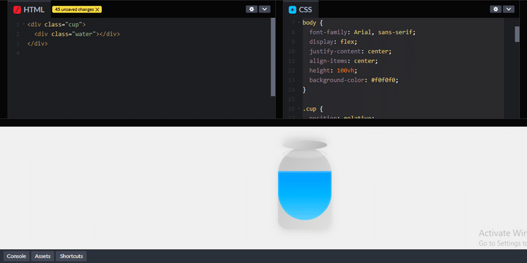
Creating a 3D water cup effect using only CSS can be a fun challenge. You can simulate a 3D effect by using box-shadow, border-radius, and linear-gradient properties to give the appearance of depth and realistic styling for both the cup and the water.
Here’s a simple example of how you can create a 3D cup of water using CSS:
HTML:
#html
<!DOCTYPE html>
<html lang="en">
<head>
  <meta charset="UTF-8">
  <meta name="viewport" content="width=device-width, initial-scale=1.0">
  <title>3D Water Cup CSS</title>
  <link rel="stylesheet" href="styles.css">
</head>
<body>
  <div class="cup">
    <div class="water"></div>
  </div>
</body>
</html>
CSS (3D Water Cup Effect):
#css #styling
* {
  margin: 0;
  padding: 0;
  box-sizing: border-box;
}

body {
  font-family: Arial, sans-serif;
  display: flex;
  justify-content: center;
  align-items: center;
  height: 100vh;
  background-color: #f0f0f0;
}

.cup {
  position: relative;
  width: 120px;
  height: 180px;
  background: linear-gradient(135deg, #c0c0c0 0%, #e0e0e0 100%);
  border-radius: 60px 60px 20px 20px;
  box-shadow: 0 5px 15px rgba(0, 0, 0, 0.1), inset 0 5px 10px rgba(255, 255, 255, 0.1);
  display: flex;
  flex-direction: column;
  justify-content: flex-end;
}

.water {
  position: absolute;
  bottom: 20px;
  width: 100%;
  height: 60%;  /* Adjust height for water level */
  background: linear-gradient(180deg, #0099ff, #80ccff);
  border-radius: 0 0 60px 60px;
  box-shadow: inset 0 2px 5px rgba(255, 255, 255, 0.5);
}

.cup:before {
  content: '';
  position: absolute;
  top: -15px;
  left: 10px;
  width: 100px;
  height: 20px;
  background: linear-gradient(135deg, #e0e0e0 0%, #b3b3b3 100%);
  border-radius: 50%;
  box-shadow: 0 -5px 15px rgba(0, 0, 0, 0.15);
}

.cup:after {
  content: '';
  position: absolute;
  top: 5px;
  left: 10px;
  width: 100px;
  height: 20px;
  background: rgba(255, 255, 255, 0.2);
  border-radius: 50%;
  box-shadow: inset 0 1px 5px rgba(0, 0, 0, 0.1);
}

Review:
- Cup Design (
.cup):- The cup is created using a
divwith aborder-radiusto make it round at the top and flat at the bottom. - We use a linear gradient background (
linear-gradient(135deg, #c0c0c0 0%, #e0e0e0 100%)) to create the metallic effect of the cup. - Box-shadow is used to create depth, both for external shadows (
box-shadow: 0 5px 15px rgba(0, 0, 0, 0.1)) and an inset shadow (inset 0 5px 10px rgba(255, 255, 255, 0.1)) to give it a 3D effect.
- The cup is created using a
- Water Design (
.water):- The water inside the cup is represented by a
divpositioned at the bottom of the cup. It’s styled with a linear gradient for a realistic water effect (background: linear-gradient(180deg, #0099ff, #80ccff)). - The
border-radiusis set to match the shape of the cup’s bottom, giving it a curved appearance. - An inset shadow is added to simulate the reflective nature of the water (
box-shadow: inset 0 2px 5px rgba(255, 255, 255, 0.5)).
- The water inside the cup is represented by a
- Cup Rim (
.cup:before):- The
:beforepseudo-element is used to create the rim of the cup, using a gradient and a shadow for depth.
- The
- Cup Inner Reflection (
.cup:after):- The
:afterpseudo-element creates an inner reflection near the top of the cup to simulate light reflecting off the surface of the water.
- The
Customization:
- You can adjust the height of the
.waterdiv to simulate different water levels inside the cup. - The
linear-gradientcolors can be modified to change the appearance of the cup and water. - You can adjust the
box-shadowproperties for different lighting and depth effects.
Output:
This code creates a 3D cup with water effect that looks like it’s sitting on a flat surface, using only HTML and CSS for styling. The depth is simulated with shadows, gradients, and border-radius for a realistic 3D appearance.
Let me know if you’d like to explore adding animations or other effects!
From redesigning a website to bespoke web development, learn the best practices and services to develop a robust online presence. If you need local designers or best-rated firms, we have you covered.
Related Links!
- CTA Bot Box with Alert in HTML!
- Displaying an Alternate Image if the Original is Not Found!
- Combining the Description and Reviews Tabs in WooCommerce!
- Remove Default Chrome Styles for Select Inputs and Apply Custom Styles!
- Creating a Responsive Five-Column Layout with Updated Bootstrap!
Common Challenges in Managing Code Complexity Coding Filters!
Managing code complexity is a frequent challenge for developers. As applications grow, maintaining clean, readable, and efficient code becomes increasingly difficult. Using coding filters can help by isolating specific logic or data, reducing clutter, and improving overall manageability, making it easier to tackle complexity.


