When designing modern web interfaces, aligning elements like headings and buttons is crucial for creating a clean and user-friendly layout. This article explores how to align a gradient heading with a button using HTML and CSS, ensuring they remain aligned across various screen sizes.
Gradient HTML Structure
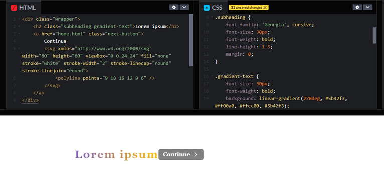
Start by creating a simple HTML structure. Use a <div> to wrap your heading and button, ensuring they are part of the same flex container.
#html
<div class="wrapper">
    <h2 class="subheading gradient-text">Lorem ipsum</h2>
    <a href="home.html" class="next-button">
        Continue
        <svg xmlns="http://www.w3.org/2000/svg" width="60" height="60" viewBox="0 0 24 24" fill="none" stroke="white" stroke-width="2" stroke-linecap="round" stroke-linejoin="round">
            <polyline points="9 18 15 12 9 6" />
        </svg>
    </a>
</div>
CSS Styling
To ensure the heading and button align properly, use CSS flexbox. Here’s how to set it up:
- Flexbox Container: The
.wrapperclass utilizesdisplay: flexto create a flexible layout. This allows you to align the heading and button on the same line easily. - Alignment: Use
align-items: centerto center the heading and button vertically, andjustify-content: space-betweento space them out appropriately. - Gradient Text: The gradient effect is achieved using the
backgroundproperty andbackground-clip. The text is transparent, allowing the gradient to show through. - Button Styles: The button has padding, a background color, and a hover effect that changes both background and text color.
#css
.wrapper {
    display: flex;                /* Use flexbox for alignment */
    align-items: center;         /* Center items vertically */
    justify-content: space-between; /* Space between items */
    padding: 80px 10px 0;       /* Adjust padding for spacing */
}

.subheading {
    font-family: 'Georgia', cursive;
    font-size: 30px;
    font-weight: bold;
    line-height: 1.5;
    margin: 0;
}

.gradient-text {
    font-size: 30px;
    font-weight: bold;
    background: linear-gradient(270deg, #5b42f3, #ff00a0, #ffcc00, #5b42f3);
    background-size: 400%;
    -webkit-background-clip: text;
    -webkit-text-fill-color: transparent;
    animation: gradient-animation 5s ease infinite;
    margin: 0;
    letter-spacing: 0.08em;
}

@keyframes gradient-animation {
    0% { background-position: 0% 50%; }
    50% { background-position: 100% 50%; }
    100% { background-position: 0% 50%; }
}

.next-button {
    display: flex;
    align-items: center;
    gap: 5px;
    font-family: 'Georgia', cursive;
    color: white;
    font-weight: bold;
    text-decoration: none;
    border-radius: 6px;
    padding: 6px 12px;
    background-color: rgba(0, 0, 0, 0.5); /* Add a background color */
    transition: background-color 0.3s, color 0.3s;
}

.next-button svg {
    width: 20px;
    height: 20px;
}

.next-button:hover {
    background-color: rgba(155, 55, 9, 0.8); /* Change background on hover */
    color: rgb(155, 55, 9);
}

.next-button:hover svg {
    stroke: rgb(155, 55, 9);
}
The CSS animation for the gradient text adds a dynamic visual effect, drawing attention to the heading. The button includes an SVG icon, enhancing the user experience.
Note
By following these steps, you can easily align a gradient heading and a button on the same line across different screen sizes. Using flexbox for layout ensures responsiveness, making your design adaptable to various devices. This technique not only improves aesthetics but also enhances usability, creating a more engaging web experience.
From concept to launch, our website design solutions encompass all elements of building a beautiful online presence. Join hands with skilled local web designers who have expertise in responsive designs, easy navigation, and conversion-based development.
Related Links!
- Creating a Gradient Column in a Table!
- Multi-Category Item Filtering in JavaScript!
- Save the file in HTML using JavaScript!
- How you can stop a <dialog> from closing with the Esc key?
- What regex matches an tag in HTML?
Coding Filters Enhance Collaboration in Development Teams!
In team-based development environments, coding filters help enhance collaboration by making code more modular and easier to understand. By using filters, developers can work on different parts of an application without interfering with one another, streamlining the development process and improving team productivity.


