Animation is a powerful tool for enhancing the visual appeal of web applications, especially in interactive character designs. However, when working with CSS animations and SVG graphics, developers often encounter limitations with specific transform properties.
One common issue is the difference in behavior between translateY and scaleY, particularly in the context of eyelid animations in character designs.
What Are Transform Properties?
Transform properties in CSS allow developers to manipulate an element’s position, size, and rotation in a two-dimensional or three-dimensional space. The most commonly used transform properties include:
- translateX / translateY: Moves an element along the X or Y axis.
- scaleX / scaleY: Resizes an element horizontally or vertically.
- rotate: Rotates an element around a specified point.
The Issue: TranslateY vs. ScaleY
The Problem with TranslateY
In certain scenarios, such as animating eyelids, developers may find that using translateY does not produce the expected results. Some reasons for this limitation include:
- Rendering Behavior: The SVG rendering engine may not interpret
translateYcorrectly when applied to specific SVG elements. - Clip Paths and Overflow: When elements are clipped or overflow their bounds, using
translateYmight not visually translate them as intended.
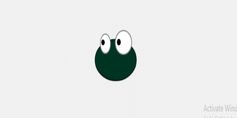
This code creates an interactive character assembly interface featuring an animated character with eyes and eyelids that respond to mouse movements. The character’s head color can also change randomly when specific keys are pressed.
HTML Structure
#html
<html lang="en">
<head>
    <meta charset="UTF-8">
    <meta name="viewport" content="width=device-width, initial-scale=1.0">
    <title>Character Assembly</title>
    <link rel="stylesheet" href="player.css">
</head>
<body>
    <div class="guide">
        <object data="https://codingfilters.com/svgs/char/shapes/30.svg" type="image/svg+xml" class="part body"></object>

    </div>

    <div class="character">

    <div class="guide">
        <object data="https://codingfilters.com/svgs/char/shapes/30.svg" type="image/svg+xml" class="part body"></object>

    </div>

    <div class="whole_head">


    <div class="eyes">


<svg id="eyes_svg">
    <g transform="matrix(1.0, 0.0, 0.0, 1.0, 57.3, 26.6)">
        <path d="M26.55 -26.6 Q39.25 -26.6 48.25 -18.8 57.25 -11.0 57.25 0.0 57.25 11.0 48.25 18.8 39.25 26.6 26.55 26.6 13.85 26.6 4.85 18.8 -4.15 11.0 -4.15 0.0 -4.15 -11.0 4.85 -18.8 13.85 -26.6 26.55 -26.6 M-24.7 -12.75 Q-19.1 -6.35 -19.1 2.7 -19.1 11.75 -24.7 18.15 -30.3 24.55 -38.2 24.55 -46.1 24.55 -51.7 18.15 -57.3 11.75 -57.3 2.7 -57.3 -6.35 -51.7 -12.75 -46.1 -19.15 -38.2 -19.15 -30.3 -19.15 -24.7 -12.75" fill="#ffffff" fill-rule="evenodd" stroke="none"/>
    </g>

    <!-- Pupils -->
    <g id="pupils" transform="matrix(1.0, 0.0, 0.0, 1.0, 34.5, 7.0)">
        <path d="M-24.25 4.75 Q-26.0 6.5 -28.5 6.5 -31.0 6.5 -32.75 4.75 -34.5 3.0 -34.5 0.5 -34.5 -2.0 -32.75 -3.75 -31.0 -5.5 -28.5 -5.5 -26.0 -5.5 -24.25 -3.75 -22.5 -2.0 -22.5 0.5 -22.5 3.0 -24.25 4.75" fill="#000000" fill-rule="evenodd" stroke="none"/>
        <path d="M33.15 4.95 Q31.1 7.0 28.2 7.0 25.3 7.0 23.25 4.95 21.2 2.9 21.2 0.0 21.2 -2.9 23.25 -4.95 25.3 -7.0 28.2 -7.0 31.1 -7.0 33.15 -4.95 35.2 -2.9 35.2 0.0 35.2 2.9 33.15 4.95" fill="#000000" fill-rule="evenodd" stroke="none"/>
    </g>
          <clipPath id="cut-bottom">
      <defs><clipPath clipPathUnits="userSpaceOnUse" id="a"><path d="M-57.3-26.6v53.2H3.839c-.02-.301-.042-.6-.06-.901-2.963-.245-5.933-.587-8.878-.643-.655-1.858-1.444-3.675-1.967-5.574-.263-.958-.582-3.19-.855-5.266-6.813-.163-3.393-1.313-.123-.97-.095-.755-.228-1.738-.274-2.133-.457-3.96-.765-7.936-1.072-11.91-.203-2.596-.417-5.192-.633-7.787-.846-10.18 3.516-15.993 8.582-17.073.037-.314.08-.628.118-.943zm52.1 40.836-.01.002.01.008v-.01z"/></clipPath></defs><path d="M26.55-26.6q12.7 0 21.7 7.8t9 18.8q0 11-9 18.8-9 7.8-21.7 7.8t-21.7-7.8q-9-7.8-9-18.8t9-18.8q9-7.8 21.7-7.8M-24.7-12.75q5.6 6.4 5.6 15.45 0 9.05-5.6 15.45-5.6 6.4-13.5 6.4t-13.5-6.4q-5.6-6.4-5.6-15.45 0-9.05 5.6-15.45 5.6-6.4 13.5-6.4t13.5 6.4" fill="#fff" fill-rule="evenodd" style="fill:blue" clip-path="url(#a)" transform="translate(57.3 26.6)"/>
    </clipPath>


    <!-- Eyelids (blinking animation) -->

<g clip-path="url(#cut-bottom)">
<g class="eyelid_outline" transform="matrix(1.0, 0.0, 0.0, 1.0, 66.55, 1.35)">
    <path d="M66.55 1.4 L-66.55 1.4 -66.55 -1.35 66.55 -1.35 66.55 1.4" fill="#000000" fill-opacity="0.49803922" fill-rule="evenodd" stroke="none"/>
  </g>
  </g>

 <g class="eyelid"  transform="matrix(1.0, 0.0, 0.0, 1.0, 57.3, 26.6)">
    <path id="eyelids_color" d="M26.55 -26.6 Q39.25 -26.6 48.25 -18.8 57.25 -11.0 57.25 0.0 57.25 11.0 48.25 18.8 39.25 26.6 26.55 26.6 13.85 26.6 4.85 18.8 -4.15 11.0 -4.15 0.0 -4.15 -11.0 4.85 -18.8 13.85 -26.6 26.55 -26.6 M-24.7 -12.75 Q-19.1 -6.35 -19.1 2.7 -19.1 11.75 -24.7 18.15 -30.3 24.55 -38.2 24.55 -46.1 24.55 -51.7 18.15 -57.3 11.75 -57.3 2.7 -57.3 -6.35 -51.7 -12.75 -46.1 -19.15 -38.2 -19.15 -30.3 -19.15 -24.7 -12.75" fill="#2d2d2d"/>


</g>

    <g id="eyesoutline" transform="matrix(1.0, 0.0, 0.0, 1.0, 57.3, 26.6)">
    <path d="M-50.2 -11.05 Q-55.2 -5.35 -55.2 2.7 -55.2 10.8 -50.2 16.5 -45.25 22.2 -38.15 22.2 -31.1 22.2 -26.1 16.5 -21.15 10.8 -21.1 2.7 -21.15 -5.35 -26.1 -11.05 -31.1 -16.8 -38.15 -16.8 -45.25 -16.8 -50.2 -11.05 M-57.3 2.7 Q-57.3 -6.35 -51.7 -12.75 -46.1 -19.15 -38.2 -19.15 -30.3 -19.15 -24.7 -12.75 -19.1 -6.35 -19.1 2.7 -19.1 11.75 -24.7 18.15 -30.3 24.55 -38.2 24.55 -46.1 24.55 -51.7 18.15 -57.3 11.75 -57.3 2.7" fill="#000000" fill-opacity="0.49803922" fill-rule="evenodd" stroke="none"/>
    <path d="M26.55 -24.3 Q14.9 -24.3 6.7 -17.15 -1.55 -10.05 -1.55 0.05 -1.55 10.1 6.7 17.25 14.9 24.35 26.55 24.4 38.15 24.35 46.4 17.25 54.65 10.1 54.65 0.05 54.65 -10.05 46.4 -17.15 38.15 -24.3 26.55 -24.3 M26.55 -26.6 Q39.25 -26.6 48.25 -18.8 57.25 -11.0 57.25 0.0 57.25 11.0 48.25 18.8 39.25 26.6 26.55 26.6 13.85 26.6 4.85 18.8 -4.15 11.0 -4.15 0.0 -4.15 -11.0 4.85 -18.8 13.85 -26.6 26.55 -26.6" fill="#000000" fill-opacity="0.49803922" fill-rule="evenodd" stroke="none"/>
  </g>


</svg>


        </div>

        <!-- Outline SVG -->
        <div class="head">


            <svg id="head_svg">


    <svg id="head_shape" xmlns="http://www.w3.org/2000/svg" width="150" height="90">


              <g transform="matrix(1.0, 0.0, 0.0, 1.0, 75.0, 45.0)">
    <path id="head_color" d="M75.0 0.0 Q75.0 18.65 53.0 31.8 31.05 45.0 0.0 45.0 -31.05 45.0 -53.05 31.8 -75.0 18.65 -75.0 0.0 -75.0 -18.65 -53.05 -31.85 -31.05 -45.0 0.0 -45.0 31.05 -45.0 53.0 -31.85 75.0 -18.65 75.0 0.0" fill="#123321" fill-rule="evenodd" stroke="none" />
  </g>

        <g id="headoutline" transform="matrix(1.0, 0.0, 0.0, 1.0, 75.0, 45.0)">
    <path d="M53.0 -31.85 Q75.0 -18.65 75.0 0.0 75.0 18.65 53.0 31.8 31.05 45.0 0.0 45.0 -31.05 45.0 -53.05 31.8 -75.0 18.65 -75.0 0.0 -75.0 -18.65 -53.05 -31.85 -31.05 -45.0 0.0 -45.0 31.05 -45.0 53.0 -31.85 M51.05 -29.9 Q29.9 -42.25 0.0 -42.25 -29.9 -42.25 -51.05 -29.9 -72.2 -17.5 -72.2 0.0 -72.2 17.5 -51.05 29.85 -29.9 42.25 0.0 42.25 29.9 42.25 51.05 29.85 72.2 17.5 72.2 0.0 72.2 -17.5 51.05 -29.9" fill="#000000" fill-opacity="0.49803922" fill-rule="evenodd" stroke="none"/>
  </g>

  </svg>
</svg>
</div>
</div>
    </div>
</body>
</html>- Document Structure: The HTML is structured to include the head and body elements, with the head containing metadata and links to stylesheets, and the body containing the character’s visual representation and functionality.
- Character Parts: The
<object>elements load SVG images for different parts of the character (e.g., body and head) for modularity and flexibility. - SVG Elements: The SVGs define the character’s eyes and head using vector graphics, enabling scalable and visually appealing animations.
CSS Styles
#css #animation
body {
            display: flex;
            justify-content: center;
            align-items: center;
            height: 100vh;
            background-color: #f0f0f0;
            margin: 0;
}

.character {
  position: relative;
}

.guide {
  position: absolute;
}

.part {
  position: absolute;
}

.eyes {
  position: absolute;
  z-index: 3;
  left: 19px;
}

.eyesoutline {
  position: absolute;
  z-index: 2;
  width: 100%;
  height: 100%;
}

.whole_head {
  position: absolute;
  animation: float 2s ease-in-out infinite;
}

.head {
  position: absolute;
  margin-top: 19px;
  z-index: 2;
}

.headcolor {
  z-index: 1;
  margin-top: -500px;
  position: relative;
}

.headoutline {
  z-index: 2;
  position: relative;
  width: 100%;
  height: 100%;
}

@keyframes float {
  0%,
  100% {
    transform: translateY(0);
  }
  50% {
    transform: translateY(-5px);
  }
}


@keyframes wipe-in-out-eyelid {
  0% {
    clip-path: inset(0 0 100% 0); /* Fully hidden from the bottom */
  }
  5% {
    clip-path: inset(0 0 0 0); /* Fully visible (wipe-in complete) */
  }
  10% {
    clip-path: inset(0 0 100% 0); /* Fully hidden again (wipe-out complete) */
  }
  100% {
    clip-path: inset(0 0 100% 0); /* Stay hidden for the rest of the duration */
 }
}


@keyframes eyelids-outlines {
    0% {
        transform: translateY(0.885);
  }
  5% {
    transform: translateY(0.35); /*full length of the eye.*/
  }
  10% {
    transform: translateY(0.885);
  }
  100% {
    transform: translateY(0.885);
  }
}

.eyelid {
  fill: #546634; /* Eyelid color */
  animation: wipe-in-out-eyelid 5s ease-out infinite; /* Wipe animation */
  transform-origin: center;
  position: relative;
  bottom: 0;
}
/* Animation for the line growing down, shrinking, and moving back up */
.eyelid_outline {
  animation: eyelids-outlines 5s ease-out infinite;
  transform-origin: center;
  position: absolute;
  top:8px;
}- Layout: The body uses Flexbox to center the character vertically and horizontally within the viewport. The background is a light gray (
#f0f0f0). - Positioning: Each part of the character is positioned absolutely within its relative parent, allowing for precise control over the layout.
- Animation: The
.whole_headclass applies a floating animation to the character’s head, giving a subtle bobbing effect through thefloatkeyframes.
SVG Structure and Animation
The SVG elements define the character’s appearance:
- Eyes and Eyelids: The eyes are animated to simulate blinking using CSS animations that adjust their clip-path properties, controlling visibility.
- Eyelid Animations:
wipe-in-out-eyelid: This keyframe animation creates a wipe effect to simulate blinking, moving the eyelids in and out of view.eyelids-outlines: This animation appears to make the eyelid outlines move, enhancing the visual effect of blinking.

JavaScript Functionality
#javascript
function getRandomColor() {
    const letters = '0123456789ABCDEF';
    let color = '#';
    for (let i = 0; i < 6; i++) {
        color += letters[Math.floor(Math.random() * 16)];
    }
    return color;
}

document.addEventListener('keydown', (event) => {
    if (event.key === 's' || event.key === 'S') {
        const headColor = document.getElementById('head_color');
        headColor.setAttribute('fill', getRandomColor());

        // Optional: If eyelids need to match the head color, add this:
        const eyelids = document.getElementById('eyelids_color');
        eyelids.setAttribute('fill', headColor.getAttribute('fill'));
    }
});
document.addEventListener('DOMContentLoaded', function() {
    const pupils = document.getElementById('pupils'); // Group containing both pupils

    document.addEventListener('mousemove', function(event) {
        const eyesSvg = document.getElementById('eyes_svg');
        const eyesBox = eyesSvg.getBoundingClientRect();

        // Approximate center of the eyes (you may need to adjust these values based on your design)
        const eyeCenterX = eyesBox.left + eyesBox.width / 2;
        const eyeCenterY = eyesBox.top + eyesBox.height / 2;

        const maxPupilMovement = 10; // Maximum movement inside the eye

        // Calculate the mouse position relative to the center of the eyes
        const mouseX = event.clientX;
        const mouseY = event.clientY;

        // Calculate the angle and distance for pupil movement
        const angle = Math.atan2(mouseY - eyeCenterY, mouseX - eyeCenterX);
        const distance = Math.min(maxPupilMovement, Math.hypot(mouseX - eyeCenterX, mouseY - eyeCenterY));

        // Calculate the new pupil positions
        const pupilX = Math.cos(angle) * distance;
        const pupilY = Math.sin(angle) * distance;

        // Apply the transformation to the pupils group (move it down based on calculated values)
        pupils.setAttribute('transform', `translate(${48.5 + pupilX}, ${29.0 + pupilY})`);
    });
});
With this approach, the eyelids close smoothly and effectively, demonstrating the advantage of scaleY for this type of animation.
The Advantage of ScaleY
On the other hand, scaleY appears to work seamlessly for eyelid animations. Here’s why:
- Uniform Scaling:
scaleYuniformly scales the element in the vertical direction, which can effectively create a blinking effect by making the eyelids appear to close and open. - No Clipping Issues: Since
scaleYmodifies the size rather than the position, it is less susceptible to rendering problems associated with clipping paths.
Take your skills to the next level with our in-depth guides to web development and design. Get industry best practices, learn time-saving tools, and connect with local web designers in your area for expert collaboration on your next project.
Related Links!
- Overlapping Issues with Fixed Elements in Sections!
- Animation of rotateY-180 is not displayed!
- Aligning Gradient Heading and Button on Same Line!
- Creating a Gradient Column in a Table!
- Multi-Category Item Filtering in JavaScript!
Improving Data Management with Coding Filters!
For developers dealing with large datasets, coding filters provide an effective way to manage data more efficiently. By applying filters to sort, validate, or transform data, developers can ensure that only the necessary data is processed, making applications faster and easier to maintain.


