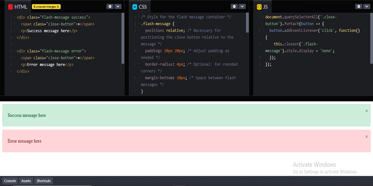
To ensure that the close (×) button is consistently positioned in the top-right corner of both success and error flash messages, you need to apply appropriate CSS styles to control the positioning. It sounds like your current layout might be missing some alignment properties, which is why the close button appears misaligned for error messages but works fine for success ones.
Here are steps to achieve a consistent top-right positioning for the close button:
1. HTML Structure for Flash Message
First, ensure your HTML structure for the flash messages is consistent. A typical setup might look like this:
#html
<div class="flash-message success">
  <span class="close-button">×</span>
  <p>Success message here</p>
</div>

<div class="flash-message error">
  <span class="close-button">×</span>
  <p>Error message here</p>
</div>
In this case, the close-button spans are used to represent the × sign, and we have different classes (success, error) for different message types.
2. CSS for Positioning
Apply the following CSS styles to position the close button in the top-right corner of the flash message container:
#css #stylesheet
/* Style for the flash message container */
.flash-message {
  position: relative; /* Necessary for positioning the close button relative to the message */
  padding: 10px 20px; /* Adjust padding as needed */
  border-radius: 4px; /* Optional: for rounded corners */
  margin-bottom: 10px; /* Space between flash messages */
}

.flash-message.success {
  background-color: #d4edda; /* Green for success */
  color: #155724; /* Text color for success */
}

.flash-message.error {
  background-color: #f8d7da; /* Red for error */
  color: #721c24; /* Text color for error */
}

/* Style for the close button */
.close-button {
  position: absolute; /* Position it relative to the .flash-message container */
  top: 10px; /* Distance from the top */
  right: 10px; /* Distance from the right */
  font-size: 20px; /* Adjust the size of the × */
  cursor: pointer; /* Show a pointer cursor on hover */
  color: #333; /* Close button color */
}

/* Optional: Change color of the close button on hover */
.close-button:hover {
  color: #000;
}
3. Explanation of CSS:
position: relative;on.flash-message: This makes the flash message container the reference point for any absolutely positioned elements inside it (like the close button).position: absolute;on.close-button: This positions the close button absolutely relative to the.flash-messagecontainer.top: 10px; right: 10px;: These properties ensure the close button stays at the top-right corner of the container with a small margin.font-sizeadjusts the size of the × sign.cursor: pointer;makes the close button interactive, indicating to the user that it is clickable.
4. Make Sure Flash Message Has Consistent Width
If the width of the success and error messages differs, this could affect the alignment of the close button. To prevent this, you can give .flash-message a consistent width or ensure it adapts to the content without changing the button’s position. If the width varies based on the content, the position: absolute on the button should still keep it in the top-right corner of the message.
5. JavaScript for Closing the Flash Message
If you want the close button to hide the message when clicked, you can add a small JavaScript function:
#javascript
document.querySelectorAll('.close-button').forEach(button => {
  button.addEventListener('click', function() {
    this.closest('.flash-message').style.display = 'none';
  });
});
This will remove the flash message when the user clicks on the close button.

6. Testing for Consistency
Make sure to apply both the success and error messages to ensure that the close button is aligned correctly in all cases. You might need to check some padding or margins depending on the overall design of your flash messages.
With this approach, both success and error messages should display the close button in the same position in the top-right corner.
Coding Filters Enhance Collaboration in Development Teams!
In team-based development environments, coding filters help enhance collaboration by making code more modular and easier to understand. By using filters, developers can work on different parts of an application without interfering with one another, streamlining the development process and improving team productivity.


